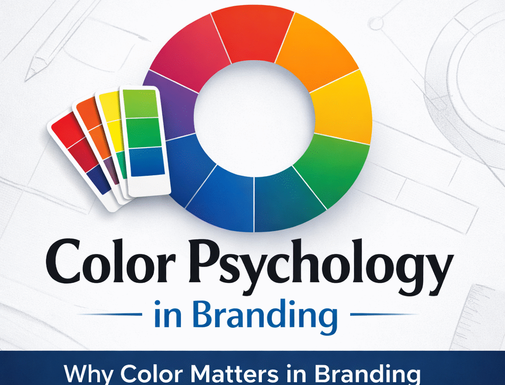
Why Color Matters in Branding and Brand Identity

When people encounter a brand for the first time, they rarely analyze the logo details or typography. What they notice almost instantly is color.
Color creates an immediate emotional response and begins shaping how people perceive a brand. Within seconds, it can make a brand feel trustworthy, energetic, calm, modern, or premium.
This is why color psychology in branding plays such an important role in building a strong brand identity. Before customers understand what a company does, color has already started communicating something about the brand.
For businesses looking to build a recognizable identity, understanding the importance of color in branding is essential.
What Is Color Psychology in Branding?
Color psychology refers to the study of how colors influence human perception, emotions, and decision-making. In branding, it explains why the colors a brand chooses can shape how people feel about it long before they read a message or understand the product.
The human brain processes color extremely quickly. Within moments of seeing a brand, color begins to communicate signals about trust, energy, quality, or sophistication. These impressions often happen subconsciously, yet they strongly influence how a brand is perceived.
Because of this, color is far more than a decorative element in design. It is a strategic tool that helps communicate a brand’s personality, positioning, and values.
When used thoughtfully, color helps create emotional connection, strengthen brand recognition, and support the overall identity of the business. This is why successful brands treat color as a fundamental part of their branding strategy, not simply a visual choice.
How Color Affects Human Perception
Color affects people both emotionally and psychologically. When the human brain sees a color, it immediately begins to associate it with certain feelings, experiences, or meanings. This reaction happens very quickly and often without conscious thought.
Because of this natural response, colors can influence how people perceive a brand, product, or message. A well-chosen color palette can make a brand feel more trustworthy, energetic, calming, or sophisticated depending on the intention behind the design.
Color also plays a role in memory and recognition. When people repeatedly see the same colors connected with a brand, those colors become easier to remember. Over time, the color itself can trigger recognition of the brand even without seeing the logo.
This is why color is considered one of the most powerful tools in branding. It helps guide perception, creates emotional connection, and strengthens how a brand is remembered.
Why Color Matters in Branding
Color works at a subconscious level. Our brains naturally associate colors with emotions, experiences, and meaning.
Because of this, a well-planned brand color strategy can influence how customers feel about a company even before they interact with its products or services.
When used intentionally, color can help a brand:
Capture attention quickly
Communicate personality without words
Build emotional connection with customers
Improve brand recognition
Strengthen trust and credibility
For designers and businesses alike, color is not simply a visual choice. It is a strategic branding decision that influences how a brand is perceived in the market.
Color and Brand Recognition
One of the most powerful benefits of color in branding is recognition.
When a brand consistently uses the same colors across its website, packaging, advertising, and social media, customers begin to associate those colors with the brand itself.
Over time, the colors become a visual shortcut for recognition.
This is why strong brands develop clear brand identity color systems within their brand guidelines. Consistency ensures that every touchpoint reinforces the same visual identity.
The result is stronger brand recognition through color.
Choosing the Right Color Strategy for a Brand
Many businesses choose colors based on personal preference. However, effective branding requires a more thoughtful approach.
A strong color strategy for brands considers several factors:
The brand’s personality
The target audience
The industry environment
The emotions the brand wants to evoke
The visual positioning among competitors
When color choices are guided by strategy rather than preference, the result is a brand identity that feels cohesive, intentional, and memorable.
This is the foundation of effective branding design strategy.
Common Mistakes Businesses Make When Choosing Brand Colors
While color plays a critical role in brand identity, many businesses approach this decision without a clear strategy. As a result, the chosen colors may look appealing visually but fail to communicate the right message to the audience.
Here are some common mistakes businesses make when selecting brand colors:
Choosing colors based on personal preference
Many business owners choose colors simply because they like them. However, branding decisions should be guided by the brand’s personality, audience, and positioning in the market rather than individual taste.
Ignoring the target audience
Colors can evoke different emotions and associations. If the color palette does not align with the expectations or preferences of the target audience, the brand message may feel inconsistent or unclear.
Following trends without strategy
Design trends change frequently. Choosing colors only because they are currently popular can make a brand feel outdated quickly. A strong color palette should be timeless and aligned with the brand’s long-term identity.
Lack of consistency across platforms
Using different shades or inconsistent color applications across marketing materials, websites, and social media weakens brand recognition. Consistency is what allows color to become a recognizable part of the brand.
Not considering brand differentiation
In competitive industries, choosing colors similar to competitors can make a brand blend in rather than stand out. A thoughtful color strategy helps create a distinct visual identity.
When color decisions are guided by strategy rather than preference, they help create a brand identity that is not only visually appealing but also meaningful and memorable.
How Designers Choose the Right Brand Colors
Choosing brand colors goes beyond selecting shades that look appealing. Professional designers approach color as part of a broader branding strategy.
Before finalizing a palette, designers consider several important factors such as the brand’s personality, the target audience, and the competitive landscape. These insights help ensure that the chosen colors communicate the right message and position the brand effectively in the market.
Designers also test how colors perform across different platforms, including websites, packaging, and marketing materials, to ensure consistency and flexibility.
By creating a structured color system rather than relying on a single color, designers build a visual identity that is cohesive, recognizable, and aligned with the brand’s long-term vision.
Final Thoughts:
Color is one of the most powerful elements in brand identity because it communicates instantly and emotionally.
A thoughtful approach to branding color psychology helps businesses create stronger connections with their audience and build lasting recognition in a competitive market.
When color decisions are guided by strategy, they transform a visual identity into a meaningful brand experience.
Because in branding, people may forget words or messages —
but they rarely forget the colors that represent a brand.
A well-chosen color strategy doesn’t just make a brand look good — it helps it be remembered. If you want your brand to truly represent your vision, Vini Infotech is here to help bring it to life.