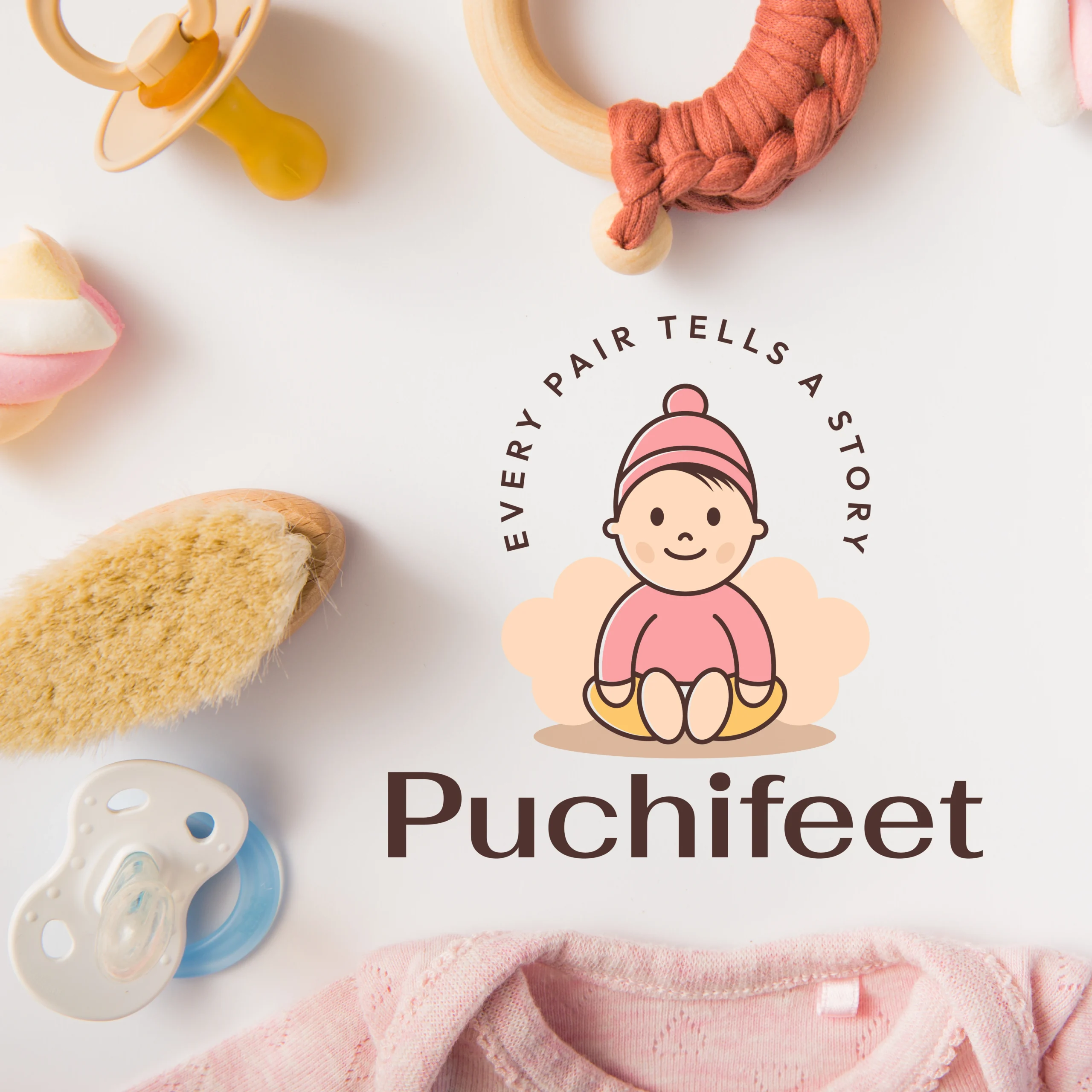
Puchifeet Logo Design

Puchifeet Logo Design puchifeet logo design scaled

Puchifeet Logo Design

Puchifeet is a footwear brand born from the idea that every step tells a story. The logo design needed to encapsulate comfort, expression, and movement, all while evoking emotion and crafting a personal connection with the audience. Our goal was to create a mark that feels warm, stylish, and meaningful — representing not just shoes, but the journeys people walk in them.

We built a visual identity that resonates with fashion-conscious individuals, storytellers, and comfort seekers — blending narrative, elegance, and authenticity.

Design Goals

Project Challenge

The challenge was to visually narrate the emotional connection people — especially parents — have with their child’s first steps. From tiny milestones to cherished memories, every product needed to carry that sense of warmth and meaning.
The logo had to feel inviting and expressive, yet remain versatile and professional across a wide range of branding formats — from baby socks to future lifestyle essentials.

Design Process & Approach

1. Concept & Direction

The name “Puchifeet” evokes playfulness and warmth. We explored visual themes around movement, footprints, and soft curves — symbolizing a human connection, comfort in every step, and stories told through shoes. The direction focused on visual storytelling through minimalism.

The name “Puchifeet” evokes playfulness and warmth, capturing the innocence of childhood.
We explored visual themes around movement, tiny footprints, and soft curves — symbolizing a human connection, comfort in every little step, and stories told through a child’s growing journey.
The direction focused on visual storytelling through minimalism, keeping the design gentle, expressive, and emotionally resonant.

2. Logo Mark Design

The central element of our logo is a smiling baby wearing a cute beanie, sitting comfortably on a soft, cloud-like cushion. This icon brings in an emotional element — it’s not just about the product, it’s about the little one who wears it.

The round, cushioned shape behind the baby creates a sense of protection, like a hug or a nest — something every parent wants for their child. It also subtly hints at the padded comfort of our socks and future apparel.

3. Typography

We selected a soft, contemporary sans-serif typeface with custom curves that reflect both approachability and modern style. The letterforms are slightly rounded, emphasizing comfort while retaining a polished look that aligns with fashionable branding.

4. Color Palette

Where It Works

Why This Logo Stands Out

Brand Statement

The Puchifeet logo is more than a design — it’s a symbol of personal journeys, especially the earliest ones.
Every curve tells a story. Every element reflects who we are, where we go, and how we feel.
With Puchifeet, every tiny step — from a baby’s first crawl to a child’s playful run — becomes a part of life’s beautiful story, built with comfort, styled with purpose, and worn with meaning.

Mockup Ideas

One-stop branding and design agency — from vision to launch

We don't just work to complete projects — we do it with love, because we love what we do.

Contact Information

Visit Us at

8th Floor, Palm Universe, Gangotri Park Main Road, Rajkot – 360005, India.