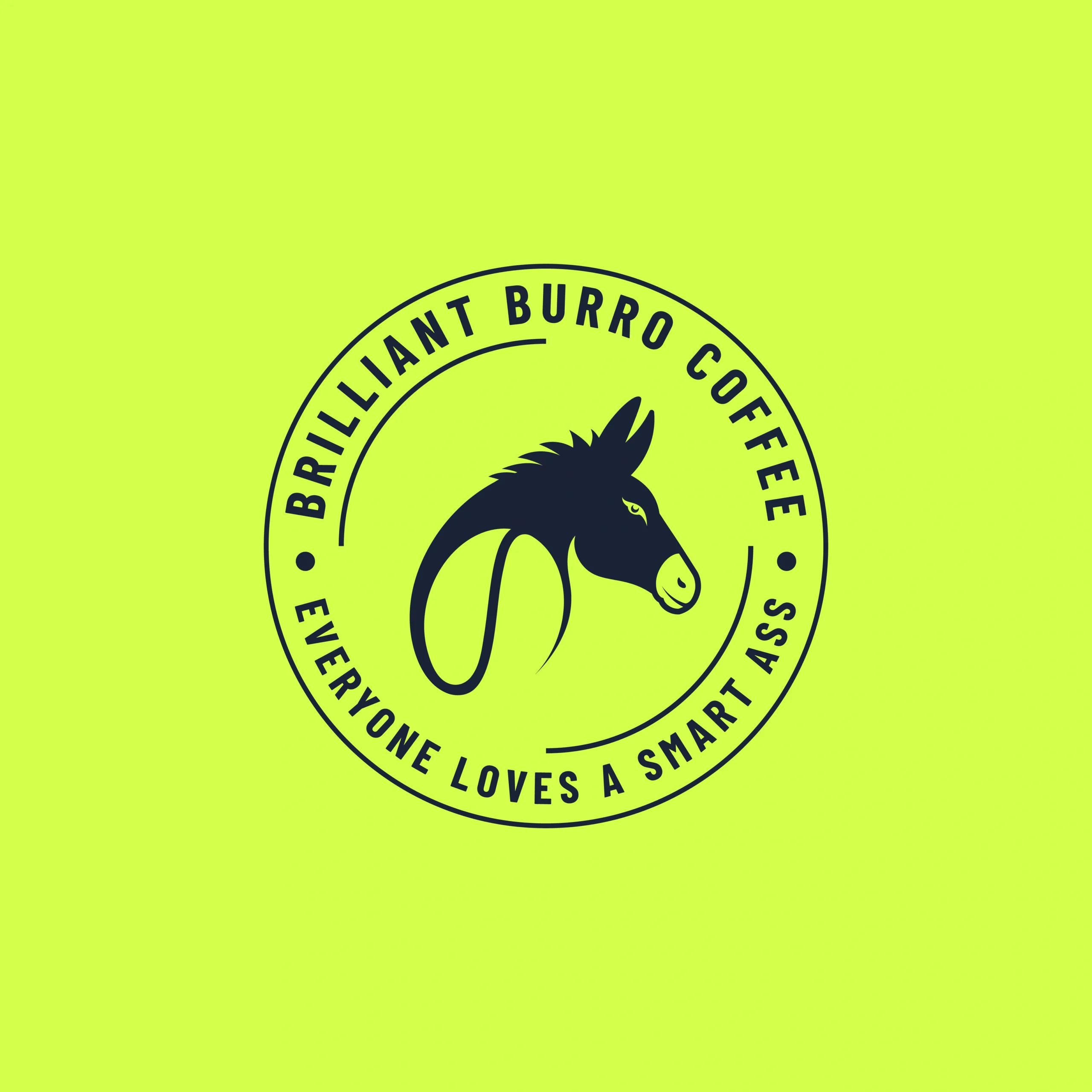
Brilliant Burro Coffee Logo Design

Brilliant Burro Coffee
Brilliant Burro Coffee is a brand rooted in artisanal craftsmanship and honest flavor. Drawing inspiration from the enduring spirit of the burro, the project called for a visual identity that balances rustic authenticity with a contemporary, inviting appeal.
Our goal was to design a logo that captures the warmth, reliability, and boldness of the brand — a mark that feels as rich and grounded as the coffee itself.
Design Goals:
- Represent strength, reliability, and artisanal quality
- Reflect a blend of rustic heritage with modern aesthetics
- Use earthy, warm tones to evoke richness and comfort
- Ensure versatility across packaging, merchandise, and digital touchpoints
Project Challenge:
The challenge lay in capturing the character-driven spirit of the burro — a humble but powerful symbol — while communicating a modern brand experience. The design had to be instantly recognizable, authentic, and versatile enough to work on a variety of coffee-related products and platforms.
Design Process & Approach:
1. Concept & Direction:
The identity began with the story of the burro — steady, hardworking, and dependable. This narrative shaped the visual exploration, leading us to icons and shapes that represent both tradition and trust. The concept focused on merging rural charm with a modern sensibility.
2. Logo Mark Design:
The logo features a stylized burro head drawn with bold, organic lines, paired with a subtle coffee bean shape beneath the neck. The strong, minimal form balances approachability with confidence, while the circular layout adds a sense of unity and structure. This fusion reflects a grounded, quality-first coffee brand with a touch of wit and character.
3. Typography:
A bold, geometric sans-serif typeface was selected to reflect clarity and confidence. Its clean structure aligns with the logo’s modern aesthetic while supporting the brand’s playful and approachable tone.
4. Color Palette:
The color palette pairs Ebony Clay with Light Lime Green — a bold, modern contrast that brings both depth and vibrancy to the identity. The deep, inky tone of Ebony Clay grounds the design with strength and clarity, while the Light Lime Green background infuses it with freshness and energy. Together, they create a visually striking combination that feels confident, youthful, and full of character — perfect for a coffee brand that stands out.
Where It Works:
- Coffee packaging, cups, and product labels
- Café signage and interior branding
- Merchandise such as mugs, aprons, and tote bags
- Social media campaigns and seasonal promotional materials
Why This Logo Stands Out:
- Clever integration of character and concept into the icon
- Balances rustic charm with modern energy
- Evokes authenticity, warmth, and trust
- Adaptable for both cozy, local branding and bold, commercial presence
Brand Statement:
The Brilliant Burro Coffee logo is more than a symbol — it’s a story brewed into every cup. It represents resilience, richness, and authenticity. Just like the burro, the brand delivers — carrying bold flavor and honest character with every pour.
Mockup Ideas:
- Coffee cup sleeve and bag design with logo front and center
- Wooden signboard with engraved logo for local café presence
- Rustic-modern website banner featuring the burro in motion
- Lifestyle social media post with the tagline: “Strong Brew. Honest Taste.”