Fish Logo Design

Fish Logo Design
The Fish Logo Design project was an exploration of fluidity, nature, and symbolism. Designed to represent the elegance of aquatic life and the importance of environmental balance, the logo needed to strike a chord with audiences across seafood, conservation, and water-related industries.
Our objective was to craft a logo that’s both graceful and meaningful — embodying the flow of water and the natural beauty of marine life while conveying trust, sustainability, and connection.
Design Goals:
- Represent aquatic motion, sustainability, and harmony with nature
- Evoke a sense of calm, flow, and organic elegance
- Utilize soft, natural shapes and curves to reflect the underwater world
- Ensure flexibility across branding for seafood, marine research, and eco-conscious platforms
Project Challenge:
The challenge was to visually capture the balance between elegance and purpose — merging aesthetic beauty with a message of ecological mindfulness. The logo had to be striking yet minimal, capable of conveying brand values at a glance while remaining adaptable for a variety of uses.
Design Process & Approach:
1. Concept & Direction:
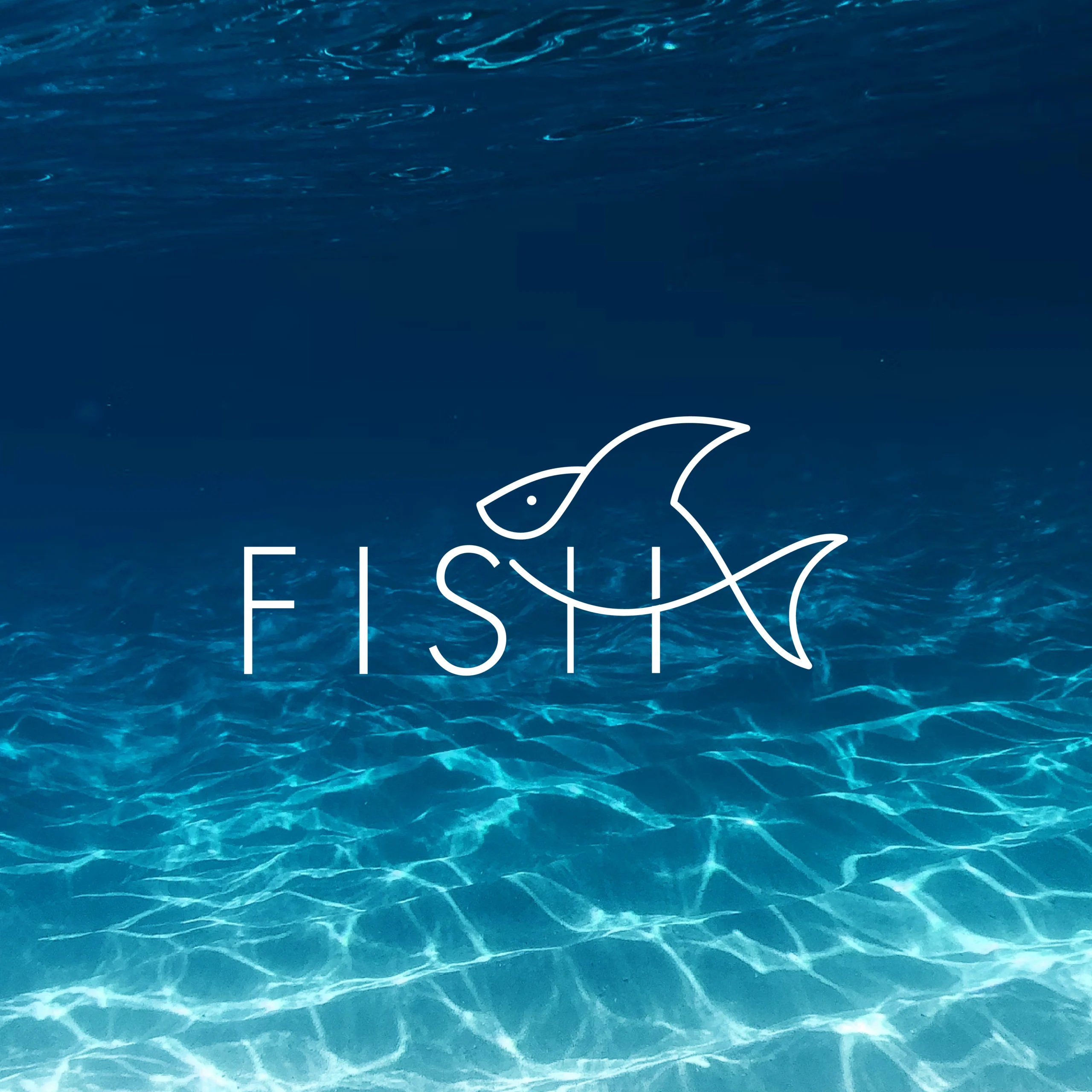
We started with the elegance and simplicity of marine life. The design merges clean geometry with playful typography — transforming the word “FISH” into a single, continuous visual form. The integration of letterforms within the fish structure speaks to seamless movement, clarity, and unity — capturing the quiet energy of life below the surface.
2. Logo Mark Design:
The mark integrates the silhouette of a fish formed through abstract, flowing lines. The design suggests motion and life, with organic curves that mirror water’s movement. Subtle elements like fins or scales may be implied, maintaining simplicity while offering layers of meaning.
3. Typography:
A refined, rounded sans-serif typeface was chosen to complement the organic nature of the logo. Its soft edges echo the smooth flow of the mark, creating a cohesive identity that feels both modern and natural.
4. Color Palette:
The palette consists of ocean-inspired hues: deep blues, seafoam greens, and soft teals — colors that evoke clarity, depth, and tranquility. The logo itself appears in white, standing out against the rich background while reinforcing a sense of purity and simplicity. These tones together create a serene, nature-connected brand identity.
Where It Works:
- Seafood product packaging and restaurant branding
- Environmental organization logos and awareness campaigns
- Marine research institutes and conservation projects
- Wellness or spa brands with aquatic themes
Why This Logo Stands Out:
- Elegant use of flowing shapes to reflect aquatic life
- Symbolizes movement, nature, and balance
- Minimal yet impactful, offering visual serenity
- Versatile for both traditional and eco-conscious branding contexts
Brand Statement:
The Fish Logo Design is more than a visual — it’s a tribute to the harmony of water and life. It captures the elegance of marine ecosystems and the importance of sustainability, offering brands a serene yet powerful identity rooted in nature and purpose.
Mockup Ideas:
- Seafood packaging with a clean ocean-blue background
- Eco-campaign poster with flowing water textures and the fish logo
- Restaurant menu with logo watermark and elegant typography
- Website header animation showing the fish gliding through waves