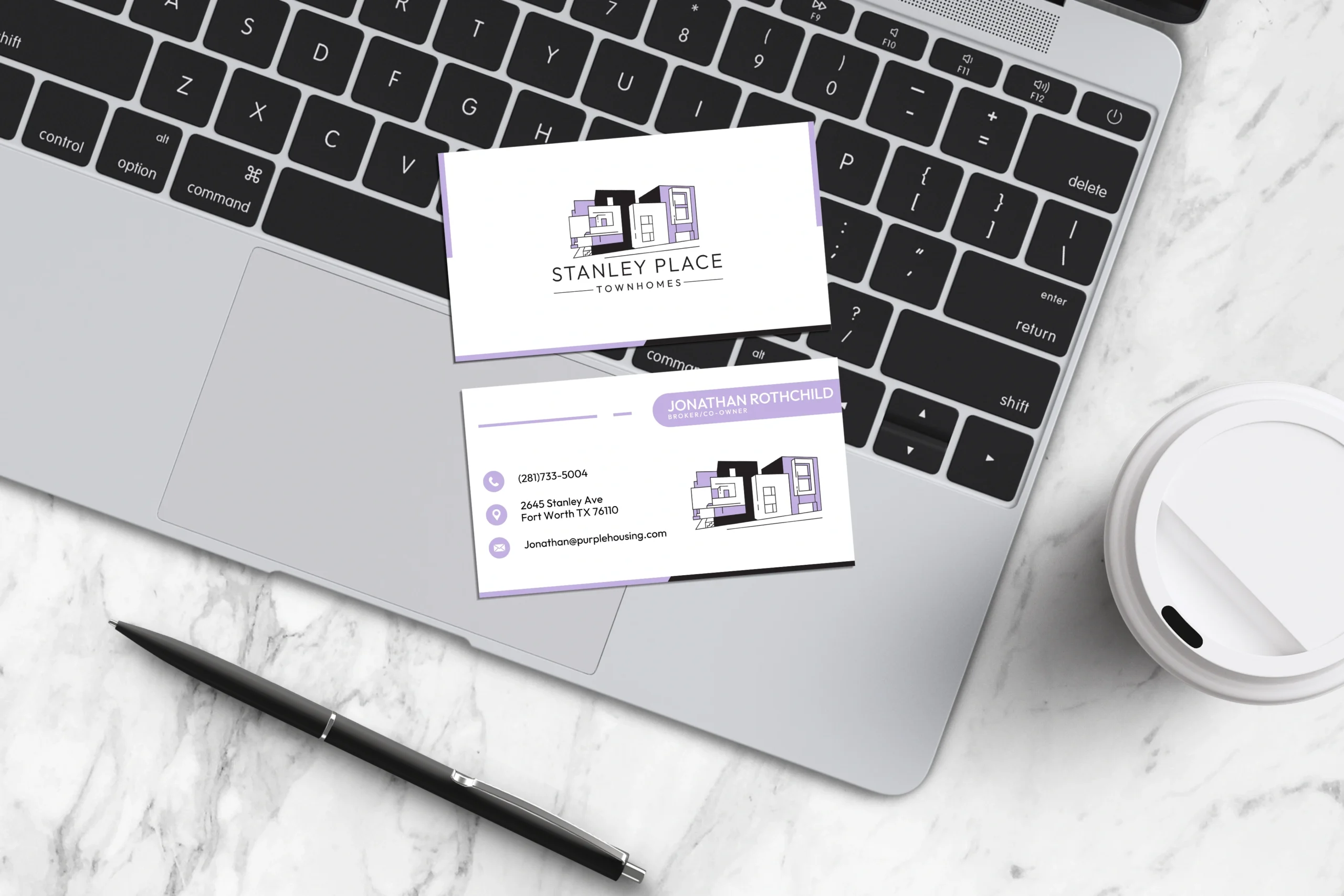
Jonathan Rothchild Business Card & Stationery

Jonathan Rothchild Stationery Design
The Jonathan Rothchild Stationery Design project was focused on elevating the personal and professional identity of a respected real estate broker and co-owner of Stanley Place Townhomes. The goal was to create a stationery system that exudes trust, elegance, and refinement — aligning with the premium quality and reputation of the properties he represents. The final outcome delivered a cohesive brand experience across touchpoints, enhancing client interactions and reinforcing credibility.
Design Goals:
- Reflect luxury, professionalism, and trust
- Ensure visual consistency across business cards, letterheads, and envelopes
- Communicate personal connection while maintaining corporate elegance
- Create timeless designs suited for high-end real estate branding
Project Challenge:
The challenge lay in balancing subtle elegance with a commanding presence — essential for making a statement in the competitive world of real estate. The stationery needed to be distinctive, yet understated, projecting confidence without overpowering the content.
Design Process & Approach:
1. Concept & Direction:
We approached the design with a focus on prestige and discretion. Inspired by upscale architecture and refined interior finishes, the stationery embraces a minimalist, structured layout, with subtle cues of sophistication throughout.
2. Logo Mark Design:
The identity leverages Jonathan Rothchild’s name with a monogram-style treatment, symbolizing trust and exclusivity. The mark complements the luxury positioning of Stanley Place Townhomes and creates instant recognition across all brand materials.
3. Typography:
A blend of classic serif and clean sans-serif fonts was used to project a timeless and professional tone. The font pairing enhances readability while establishing a high-end aesthetic suitable for luxury branding.
4. Color Palette:
The palette includes rich neutrals like charcoal, ivory, and muted gold — colors that reflect class and maturity. These tones provide strong contrast while supporting a calm, refined visual language across all printed materials.
Where It Works:
- Business cards for high-touch real estate networking
- Letterheads and envelopes for formal communications
- Client welcome kits and property presentation folders
- Personal branding elements for event or seminar materials
Why This Logo Stands Out:
- Elegant use of name as a strong personal brand symbol
- Conveys integrity, professionalism, and luxury
- Subtle, refined design suitable for printed and digital formats
- Balances authority with approachability
Brand Statement:
The Jonathan Rothchild stationery system represents more than design — it reflects a commitment to excellence, detail, and trust. It ensures that every handshake, every letter, and every exchange carries a visual message of confidence and credibility in the real estate world.
Mockup Ideas:
- Flat-lay of embossed business card with soft shadows
- Personal letter on premium textured paper with elegant letterhead
- Branded property folder with monogram seal
- Close-up of envelope corner with gold foil return address