Woman Botique Brand Style Guide

WOMEN'S CLOTHING BOUTIQUE
Brand Guidelines Overview - Woman Boutique
✦ Project Overview
This brand is dedicated to celebrating femininity through elegance, softness, and style. Woman Boutique isn’t just about fashion, it’s about curating a graceful experience for modern women through thoughtfully designed visuals and timeless brand expression.
✦ Our Design Approach
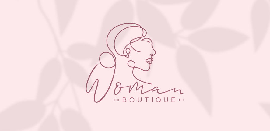
We built the brand around a hand-drawn female profile illustration, symbolizing elegance, individuality, and quiet confidence. To ensure flexibility, we created multiple logo arrangements, each maintaining the same soft, modern aesthetic.
The color palette includes muted tones like deep mauve, blush pinks, beige, etc…all chosen to evoke femininity, warmth, and balance.
Typography plays a vital role: Allison Script Regular brings a graceful, personal feel, while Gotham adds structure and clarity. Together, they create a look that’s chic, minimal, and emotionally resonant.
✦ Challenges We Faced
One key challenge was maintaining a sense of luxury and softness without becoming overly delicate. We needed the brand to feel sophisticated but accessible, visually expressive yet easy to apply across materials like labels, tags, and social content.
✦ How We Solved the Problem
By focusing on visual contrast and hierarchy, we crafted each element with clear intent. Delicate lines were balanced with bold type, and soft tones were anchored by earthy hues. This gave the system flexibility while keeping its identity intact. Every decision, from icon spacing to type size, was shaped to support both practical application and emotional resonance.
✦ Beyond the Project
Woman Boutique now carries a distinct and cohesive identity, a design language that speaks softly but confidently. With this foundation, the brand is ready to grow across platforms while staying rooted in its values of grace, individuality, and timeless style.

