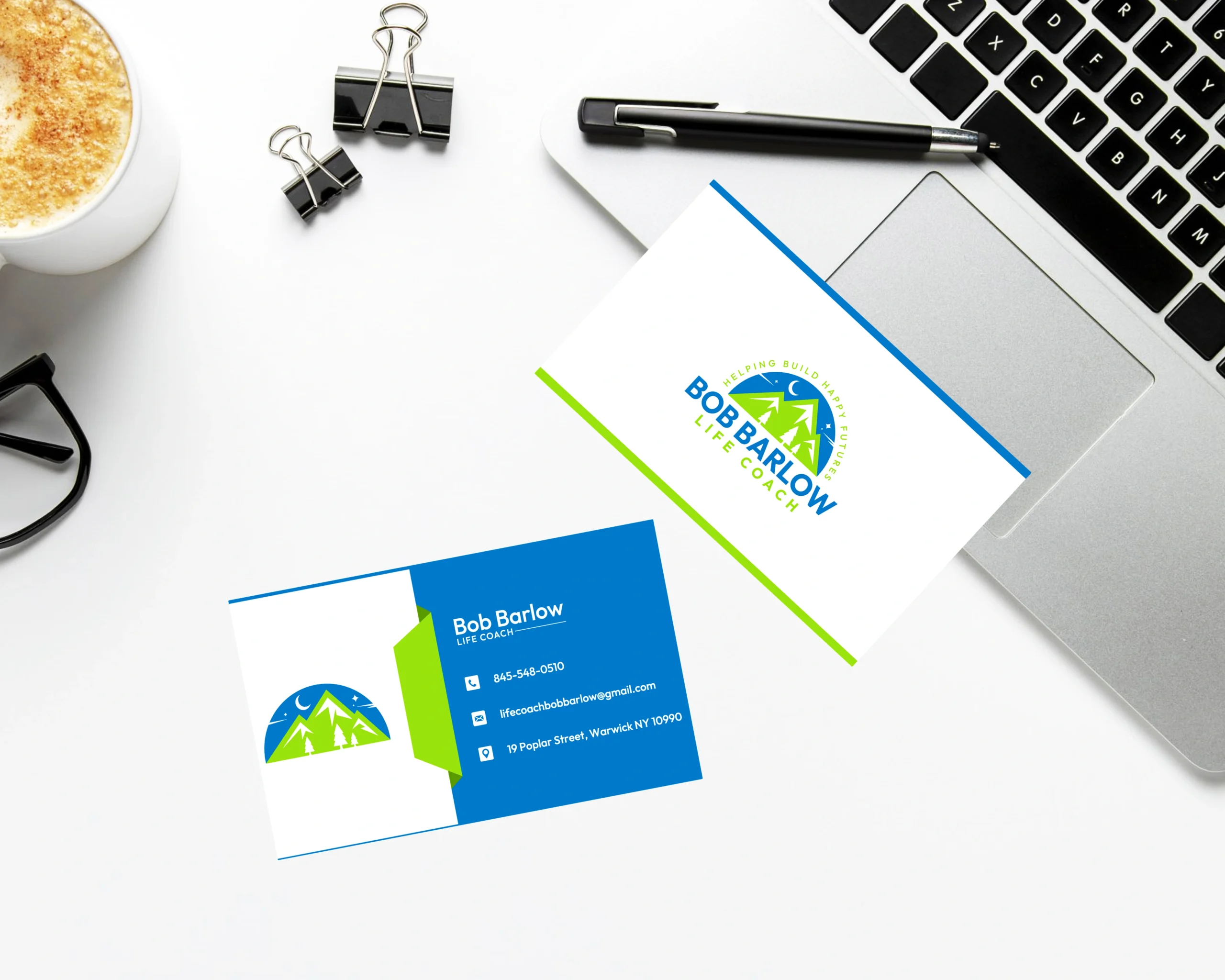
Bob Barlow Business Card & Stationery Design

Bob Barlow Life Coach Business Card
Bob Barlow’s business card and stationery design reflect the essence of his life coaching philosophy — positivity, progress, and personal clarity. The project called for a thoughtful design system that communicates trust, support, and transformation. The final identity builds instant credibility while promoting emotional connection, offering clients a warm, encouraging entry point into Bob’s coaching services.
Design Goals:
- Convey emotional support, clarity, and growth
- Use soothing yet confident visual elements
- Ensure readability and modernity for professional presentation
- Create consistency across card, letterhead, and digital touchpoints
Project Challenge:
The core challenge was to design branding that avoids clichés often associated with life coaching, instead focusing on genuine visual cues of calm, forward movement, and personal transformation. The design needed to resonate emotionally, without sacrificing professionalism.
Design Process & Approach:
1. Concept & Direction:
The creative direction centered on clarity and upward movement — visual metaphors for personal growth and life progression. We explored themes like gentle curves, sunrise gradients, and soft transitions to inspire comfort and momentum.
2. Logo Mark Design (if applicable):
Where included, the mark subtly references growth and openness, using minimal curves or rising elements. It reflects an inviting, aspirational tone that complements Bob’s coaching approach.
3. Typography:
A clean, humanist sans-serif typeface was selected for its approachable, clear, and modern characteristics. It enhances legibility while conveying trust and warmth, striking a professional yet empathetic tone.
4. Color Palette:
A calming combination of pastel blues, gentle greens, and warm neutrals grounds the identity in serenity and hope. Accent tones — like gold or coral — may be used to highlight moments of optimism or breakthrough.
Where It Works:
- Personal session note templates and onboarding forms
- Networking and client referral cards
- Branded thank-you cards and email signatures
- Printed affirmations or client growth plans
Why This Logo Stands Out:
- Balances professionalism with emotional connection
- Promotes personal clarity and hope through minimalist design
- Builds trust instantly through visual calmness
- Easily extends across both print and digital formats
Brand Statement:
The Bob Barlow brand identity is more than a set of visuals — it’s a symbol of support and potential. Every design element reflects the journey from uncertainty to fulfillment, reinforcing Bob’s mission: to help others live with clarity, purpose, and joy.
Mockup Ideas:
- Business card on a soft-toned desktop with journal and pen
- Stationery set near wellness or coaching materials
- Clean mockup of a thank-you card with inspirational quote
- Digital signature applied in a soft-color email layout