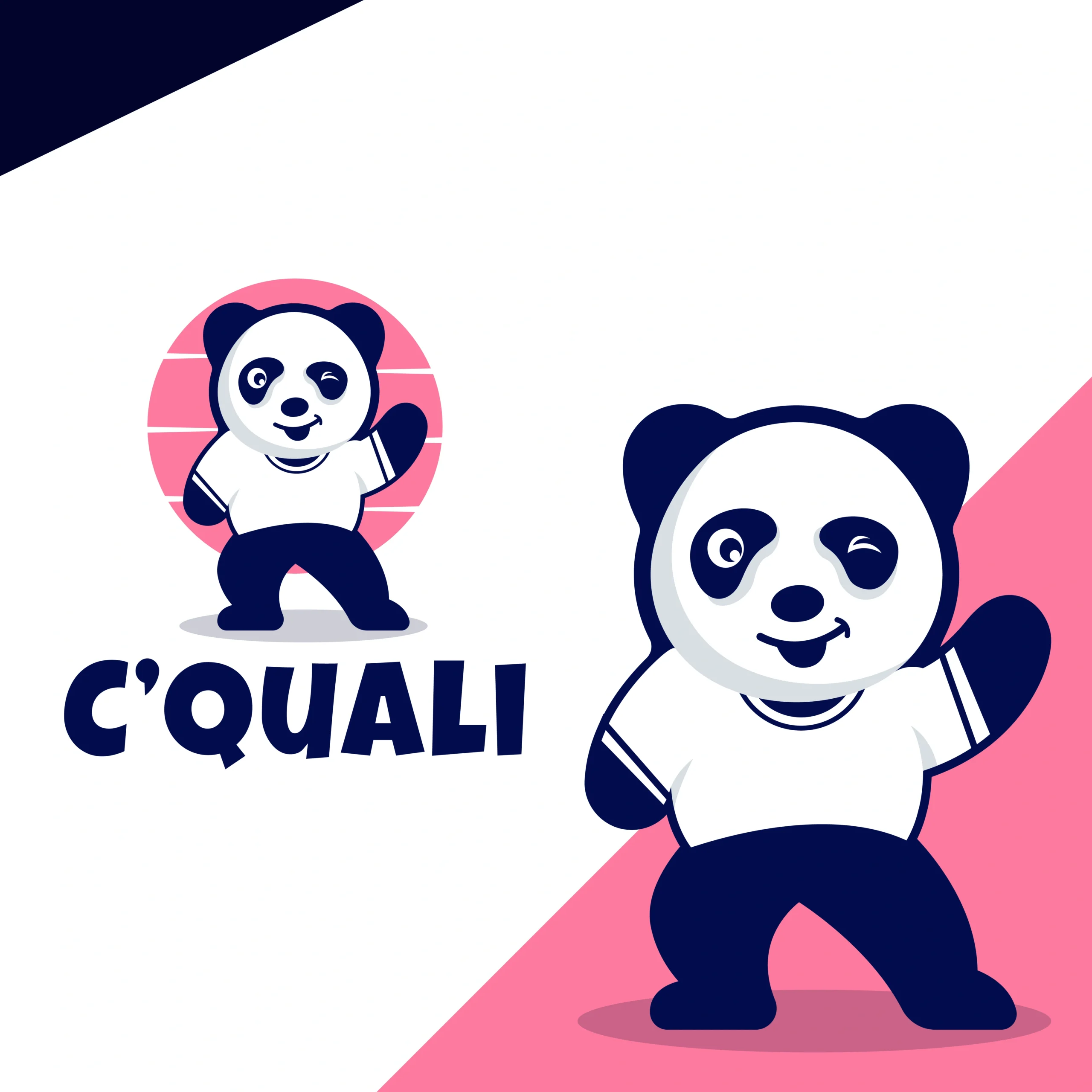
Cquali Logo Design

C’Quali logo design
C’Quali is a forward-thinking brand rooted in quality, reliability, and ease. It’s built on the idea that precision and simplicity can go hand in hand. The name reflects a fresh, clever take on “quality” — confident, smart, and designed to stand out.
The goal was to create a sleek, confident logo that communicates accuracy, trust, and forward momentum — all while remaining minimal and adaptable.
Design Goals:
- Reflect precision, quality, and modern technological innovation
- Create a clean and memorable logo for both corporate and software environments
- Use subtle symbolism to evoke excellence and continuous improvement
- Ensure versatility across UI, product branding, and professional documents
Project Challenge:
The key challenge was to balance a playful, friendly tone (through the panda mascot) with a sense of professionalism and quality assurance. The logo needed to stand out in both casual consumer interfaces and more formal business contexts, all while remaining easy to reproduce and instantly recognizable.
Design Process & Approach:
1. Concept & Direction:
We began with the idea that a panda can communicate care, reliability, and longevity—traits essential to a brand built around “quality.” Early sketches explored how to make the panda feel approachable (a winking eye and a welcoming wave) without looking too cartoonish for professional use.
2. Logo Mark Design:
The final mark features a stylized panda standing upright and giving a friendly wave. Its facial expression (one eye winking) conveys playfulness and confidence, while its posture suggests readiness to serve. A simple circular backdrop keeps the focus on the mascot and ensures a balanced, contained form that’s easy to place on any background.
3. Typography:
The font used for the C’Quali wordmark is Luckiest Guy Regular, a bold and expressive typeface that gives the brand a fun, confident personality. With its exaggerated forms and strong presence, the font brings a playful charm while maintaining legibility. It’s especially effective for catching attention and creating a lighthearted, friendly tone that aligns with the brand’s energetic spirit.
4. Color Palette:
The color system blends bubblegum pink as a vibrant accent with pure white for clarity and freshness. These are grounded by deep, professional tones like royal navy and midnight blue, which provide structure and sophistication. A touch of cool gray-blue softens the palette, adding balance and versatility. Together, these colors create a dynamic yet approachable identity that feels both modern and playful.
Where It Works:
- SaaS product interfaces, dashboards, and login screens
- Business cards, pitch decks, and client proposals
- Email signatures and branded documentation
- App icons, favicons, and digital marketing assets
Why This Logo Stands Out:
- A memorable panda symbol that evokes warmth, reliability, and approachability
- Clean and digital-friendly construction suitable for tech-driven contexts
- Professional yet playful — balancing trust with character
- Versatile enough to support a full and cohesive visual identity system
Brand Statement:
The Cquali logo represents the pursuit of excellence through smart systems and precise execution. It’s a symbol of trust, innovation, and verified quality — built for those who care about doing things right, the first time and every time.
Mockup Ideas:
- App Icon: The panda’s face and wave within a circle, optimized for small sizes.
- Website Header: Panda on the left, “C’QUALI” text on the right, over a white or light-gray background.
- Business Card: Navy background with the coral-pink circle and panda in white, reversed text in white for “C’QUALI.”
- Merchandise: White T-shirt featuring the full panda mark, coral-pink circle behind, with “C’QUALI” underneath in navy.