Ibis Bird Logo Design

Ibis Bird
The Ibis Bird Logo Design project centered on creating a visual identity that reflects the elegance, symbolism, and serenity of the ibis — a bird long associated with wisdom, resilience, and natural harmony. The objective was to deliver a refined, timeless logo that evokes connection with nature while maintaining a strong, graceful presence.
We set out to craft a design that resonates with environmentally conscious brands, conservationists, and wellness-focused organizations — emphasizing purity, balance, and adaptability.
Design Goals:
- Represent the symbolic traits of the ibis: elegance, resilience, and tranquility
- Use flowing, organic shapes to mirror natural movement and form
- Ensure versatility for use in eco-friendly, wellness, and wildlife-related contexts
Project Challenge:
The challenge was to translate the ibis’ natural poise and subtle power into a clean, iconic symbol — one that embodies nature’s grace without relying on overly literal or complex illustrations. The goal was simplicity with emotional depth and aesthetic sophistication.
Design Process & Approach:
1. Concept & Direction:
We studied the ibis’ silhouette, posture, and cultural symbolism, aiming to capture its quiet strength and elegance. Concepts included minimal line art, abstracted wings, and calm water-like movement — reflecting the bird’s relationship with both air and earth.
2. Logo Mark Design:
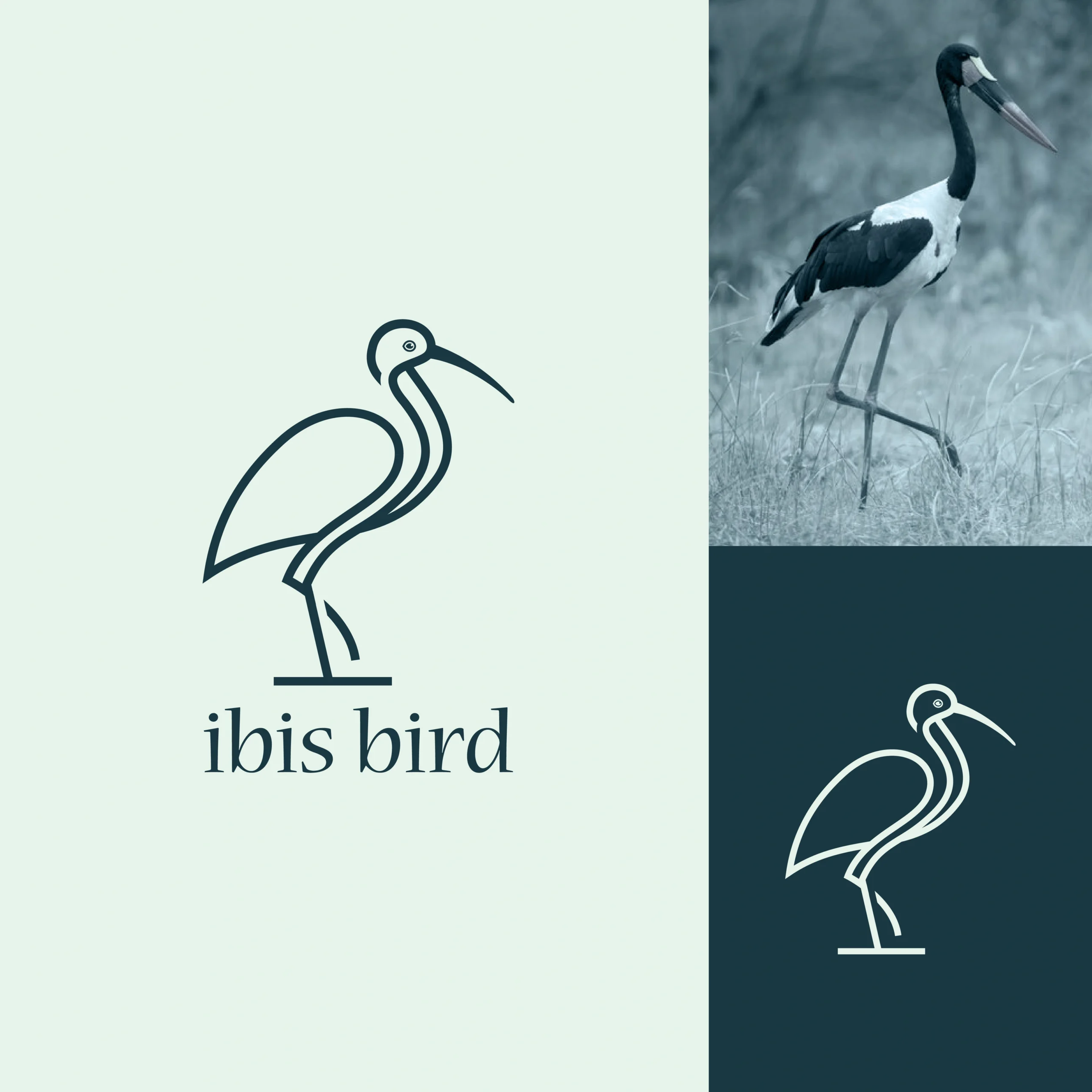
The final mark features a stylized ibis with flowing lines and open negative space. Its elongated neck and poised stance convey grace and mindfulness, while soft curves add balance and approachability. The design draws the eye upward, symbolizing ascension and clarity.
3. Typography:
A modern, refined serif typeface complements the clean lines of the ibis bird illustration. The typography conveys quiet elegance, clarity, and calm confidence — reinforcing a sense of balance, nature, and thoughtful simplicity.
4. Color Palette:
The color palette features a pale sage backdrop complemented by deep slate teal linework. This calm, nature-inspired pairing conveys a grounded elegance and quiet strength, aligning with the ibis’s graceful presence and the brand’s environmentally conscious ethos.
Where It Works:
- Eco-tourism branding and wildlife foundation materials
- Wellness and mindfulness product packaging
- Environmental education campaigns and websites
- Conservation event banners and promotional goods
Why This Logo Stands Out:
- Elegant interpretation of a unique natural form
- Symbolizes balance, wisdom, and ecological harmony
- Minimalist yet rich with layered meaning
- Adaptable across high-end or purpose-driven brand identities
Brand Statement:
The Ibis Bird Logo is a quiet symbol of beauty, resilience, and connection to nature. It reflects a brand’s commitment to mindful living, respect for the environment, and the graceful pursuit of purpose. It’s more than a bird — it’s an emblem of balance in motion.
Mockup Ideas:
- Embossed ibis logo on a natural-fiber product package
- Website hero section with soft animation of the ibis symbol
- Eco-conscious apparel tag or label featuring the minimalist bird icon
- Instagram carousel with conservation facts and the ibis as a brand ambassador