Lemonade Logo Design

Lemonade
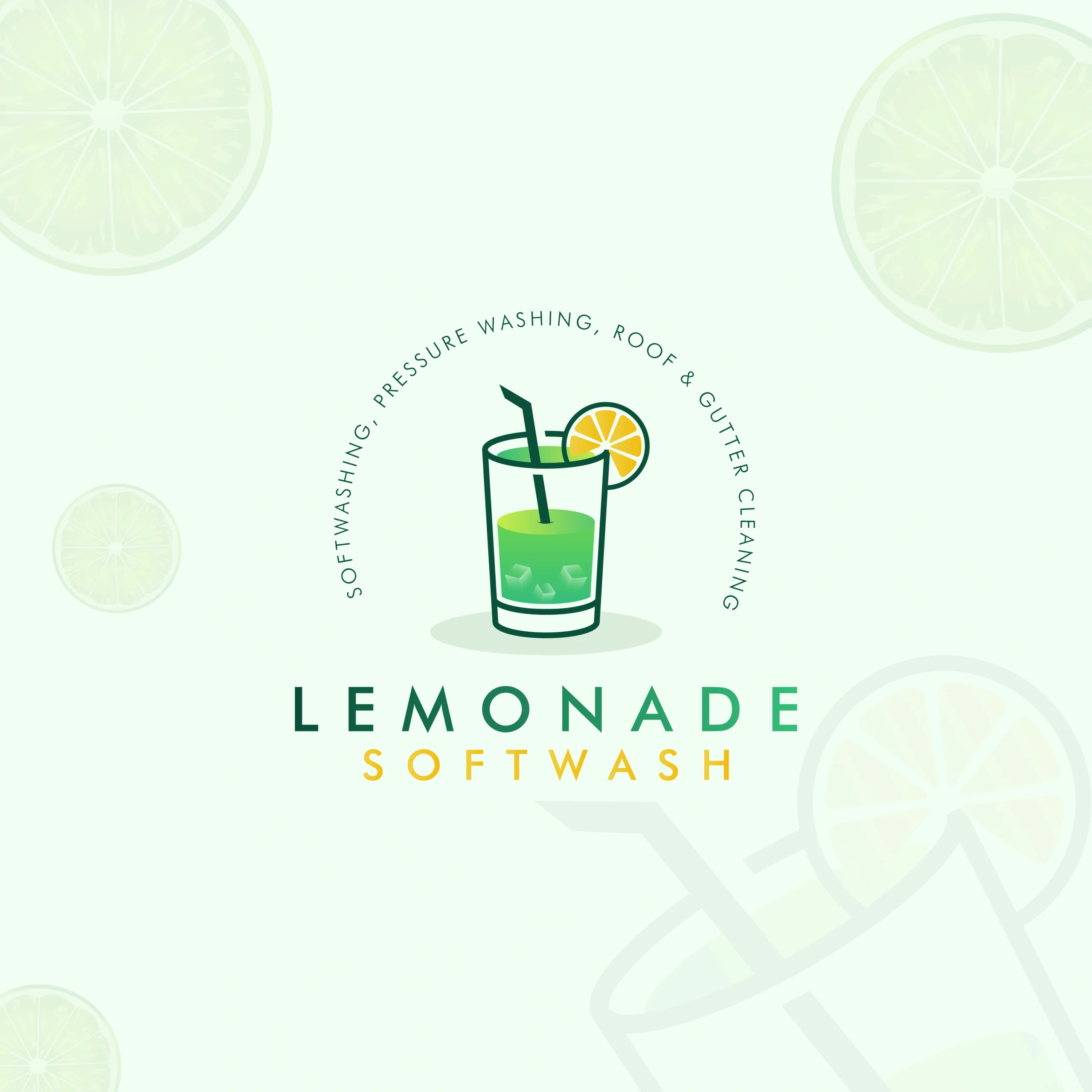
Lemonade is a vibrant brand specializing in softwashing, pressure washing, and surface cleaning services. The project required a logo that communicates freshness, energy, and reliability. We aimed to design a logo that instantly evokes the satisfaction of cleanliness and the revitalizing effect of a freshly washed home or business exterior.
The result is a visual identity that is as refreshing as its name — appealing to homeowners and businesses seeking high-quality, professional cleaning solutions.
Design Goals:
- Communicate freshness, cleanliness, and revitalization
- Incorporate citrus or water-inspired elements for a visual connection to the name
- Use bright, energetic colors that suggest trust and renewal
- Ensure adaptability across service vehicles, uniforms, signage, and digital platforms
Project Challenge:
The challenge was to visually express the concept of cleanliness in a way that feels modern and memorable — without relying on overused icons. The logo had to strike the right balance between playfulness (from the name “Lemonade”) and the professionalism expected from a top-tier cleaning company.
Design Process & Approach:
1. Concept & Direction:
We began with the central theme of citrus freshness and water clarity. Concepts revolved around droplets, lemon slices, and sparkling surfaces. The design direction prioritized clarity, energy, and simplicity — to reflect the “instant clean” experience that the brand delivers.
2. Logo Mark Design:
The final mark features a stylized lemon slice integrated with clean water droplet shapes, creating a symbol that communicates both the brand’s name and service in a single glance. The radial symmetry of the lemon also implies balance, thoroughness, and satisfaction — all qualities associated with a job well done.
3. Typography:
A bold, sans-serif typeface was selected to reflect confidence and efficiency. Rounded edges add friendliness and approachability, while strong weights ensure visibility across various applications, from uniforms to online ads.
4. Color Palette:
A palette of zesty lemon yellow, crisp white, and fresh aqua blue was chosen to capture the spirit of freshness and water-based services. Yellow signals energy and optimism, while blue evokes cleanliness and trust. The combination gives the logo an instantly uplifting and refreshing look.
Where It Works:
- Vehicle wraps for service vans and trucks
- Uniform embroidery and branded safety gear
- Door hangers, flyers, and local service advertisements
- Website, booking apps, and social media content
Why This Logo Stands Out:
- Clever combination of lemon and water imagery
- Bold and bright for instant recognition and brand recall
- Symbolizes freshness, precision, and high-quality service
- Visually consistent across physical and digital environments
Brand Statement:
The Lemonade logo represents more than just a cleaning service — it’s a symbol of transformation. From grime to shine, from dull to dazzling, it reflects the company’s promise: to deliver a fresh start every time. Clean isn’t just a result — it’s a feeling.
Mockup Ideas:
- Logo on pressure-washing van with water spray texture
- Service tech uniform with embroidered lemon-drop logo
- Before-and-after promotional flyer featuring the logo seal
- Website banner with animated lemon splash transition